Coachera
A mobile chatbot app for personal coaching developed for use in a research study by the Cornell Future of Learning Lab .
Functions
UI, Graphic Design, Front-End Web Development, Front-End Mobile Development, Branding
Team
1 Designer, Project Supervisor
Timeline
Summer 2022
01 - Background
What is Coachera?
CoachEra is a mobile app to assist users in achieving goals. A digital coach will guide you to make weekly plans and check in with you every day on your progress. Coaching focuses more on building a sustainable learning routine rather than optimizing your learning process. CoachEra is being utilized by the Cornell Future of Learning Lab to conduct research in classrooms.
Our user group centers around those who have learning goals, particularly those who have primary jobs that often need to be prioritized in daily routines, like a full-time job, full-time childcare, full-time academic degree program (a.k.a. school). CoachEra gives them support to learn outside of simple daily obligation.
02 - Character Design
The Coach
I went through various character designs of a coach that users could talk to like a companion and feel at ease with. While I originally conceptualized a human coach, our research team realized that utilizing a human coach with a distinct look could hold demographic traits that wouldn't make them feel as close should others not share those same traits.

Instead of a human coach, we settled on anthropomorphic coaches, so I got to work and conceptualized the robot animals that are now implemented!

03 - Branding
04 - User Interface
Initial Design
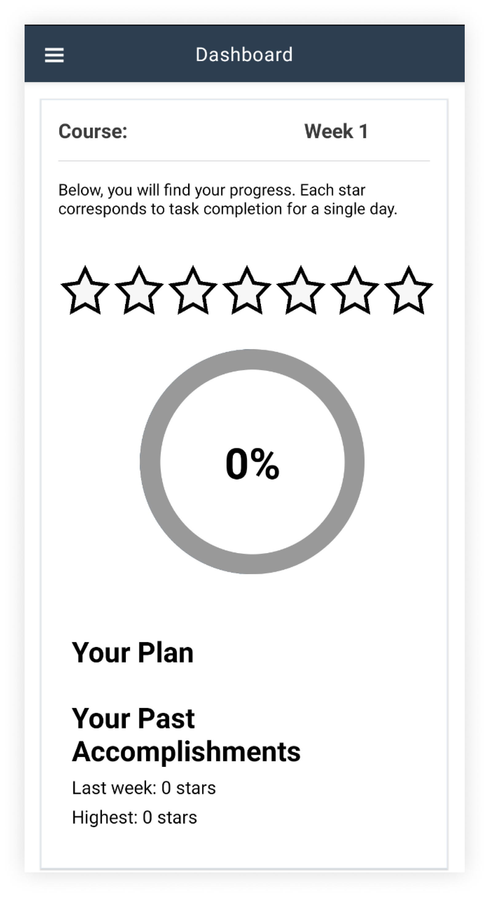
CoachEra was initially built based off pre-existing code and as such had not gone through a designer. Tasks were unclear due to a lack of formatting, and content such as 'Your Past Accomplishments' was not layed out in a visually digestible way.
Viewing this existing design, I prioritized the emphasis of important content in the dashboard and visualizing information rather than relying on text. I wanted the Dashboard to be visually engaging as a resource users would find helpful in summarizing the data that had been collected from the app.
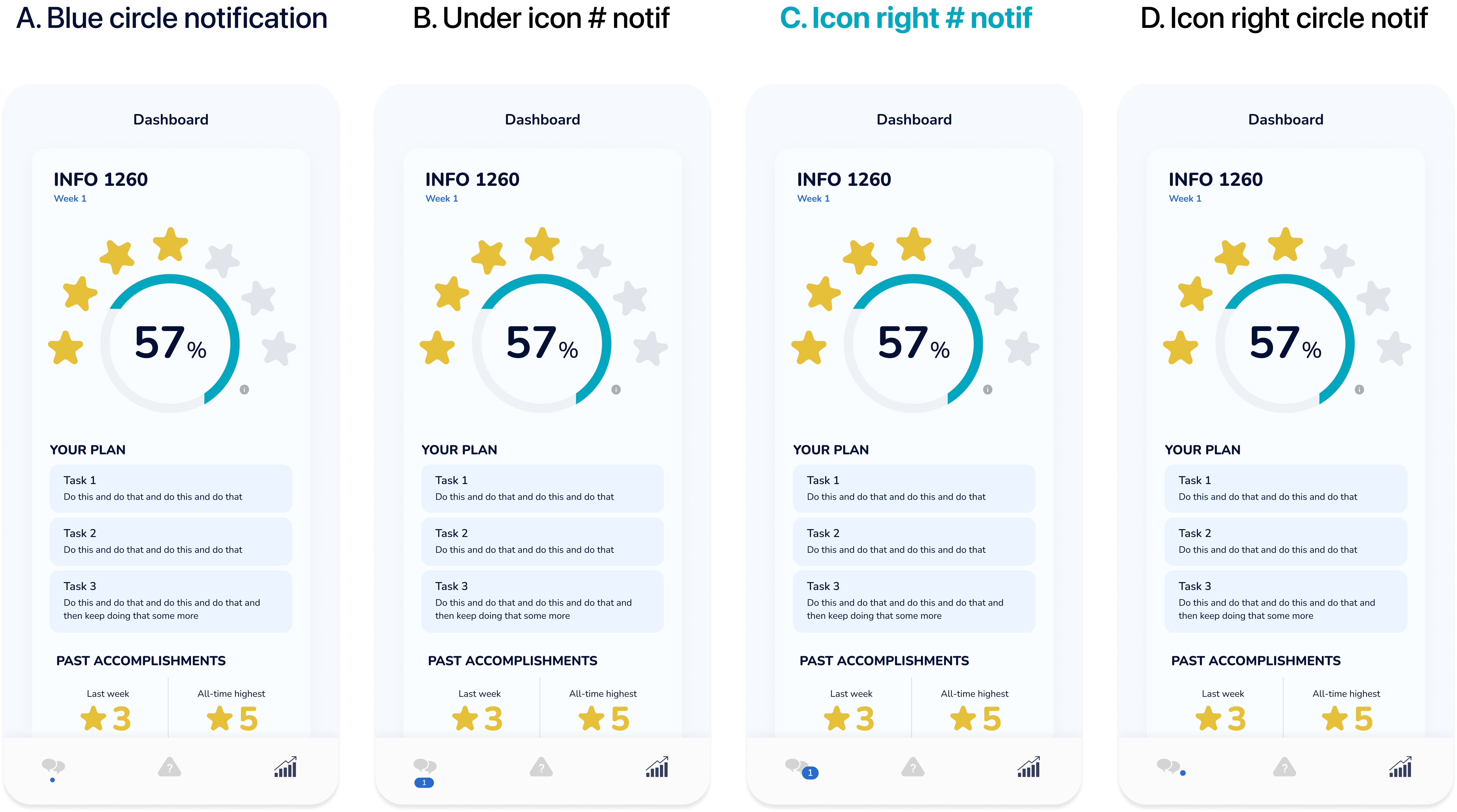
Message Notification Iterations
I iterated considering a new color palette I'd created centered around teal.
As the existing structure was already in place, iteration was mainly to improve the UI and visually update the Dashboard rather than interating through UX decisions.
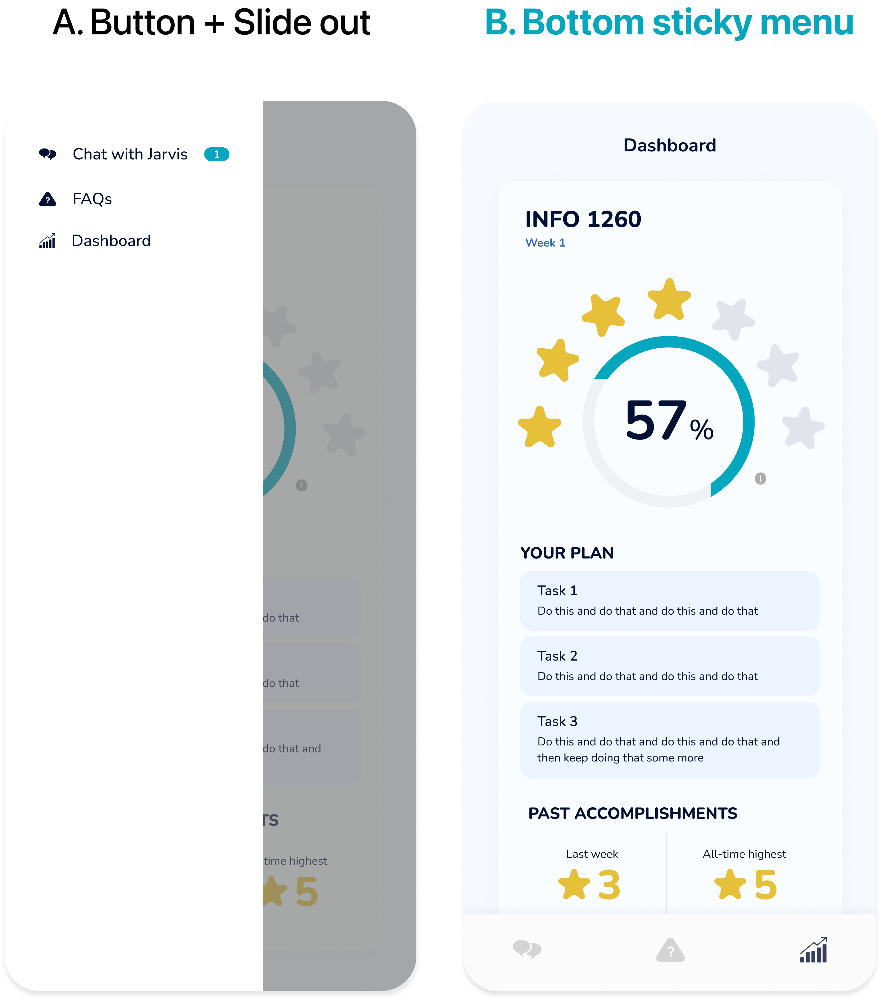
Menu Iterations
06 - Takeaways
Designer and Developer
This opportunity focused more on my visual design skills through UI improvement and branding, but was also unique for my role both as a designer and developer that was both freeing and limiting. The opportunity really allowed me to understand the troubles developers may run into when implementing designs and the necessary adjustments that might need to happen, a lesson I'll definitely take into the future.
I'm excited to see the results that CoachEra can yield and am thankful to have worked under the mentorship of Ji-Yong Cho during this research opportunity.