Zing
Zing, created by Cornell Digital Tech & Innovation , tackles grouping students through 2 products: LSC and Grouper. LSC is a platform for the Cornell Learning Strategies Center to create groups for Study Partners. Grouper is a platform for Professors to create groups for projects, assignments, etc.
Functions
User Research, User Testing, Ideation, Product Thinking, Documentation
Team
2 PMs, 2 TPMs, 5 Developers, 2 Designers
Timeline
- Fall 2022 - Spring 2023
01 - Problem
What is Zing?
Zing makes it easier for users to create student groupings.
Who are Zing users?
Professors: Use Grouper to group students for projects, assignments, etc. in their classes.
Cornell Learning Strategies Center (LSC): Use LSC to match students for their Study Partners program where students request partners to study with for a specific class.
What can we fix?
Cornell LSC staff and professors want to create groups efficiently, but they can’t do that well because:
1. They spend too much time sifting through a high volume of student data to make matches.
LSC made 2,500+ study partner matches in the 2020-2021 academic year alone!2. They struggle to email each student and keep track of emails.
There are huge volumes of students to keep up with for various requests.02 - Metrics Feature (LSC)
Overview
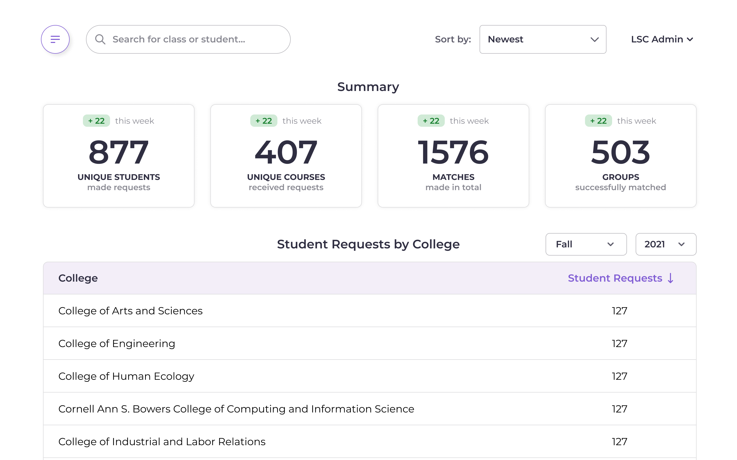
Stakeholders requested for a Metrics feature to help them understand student use of the Study Partners program!
User Group 👤
Learning Strategies Center (LSC) Administrators
User Needs 🗣
- Visualizations of total students, courses, requests, matches.
- Ability to sort by college and school year.
- High priority! User is data-centric when making decisions.
Low-Fi Entry Points
A. Entry points to a separate page ✅
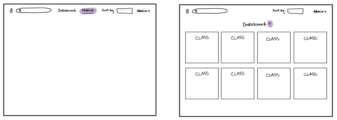
Pros:
- More space for filtering and displaying information
- Better visualizations possible from more space
Cons:
- More clicks
- Less visibility
B. Card in dashboard
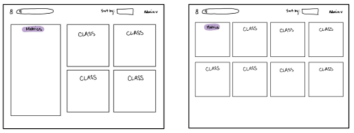
Pros:
- High visibility with constant view
- Less clicks
Cons:
- Constricts amount of data able to view at once
- Reduces visualization possibilities for data
- Diverts attention from rest of Dashboard
High-Fi Entry Points

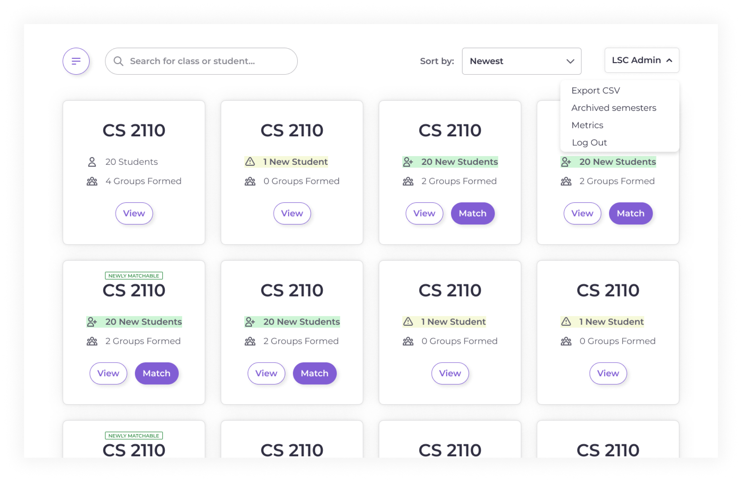
C. Admin dropdown menu ✅
Pros:
- Feature is grouped with other admin features
- Unintrusive to Dashboard
- Fitting visibility for frequency of feature use
Cons:
- Less visibility
Displaying Numbers
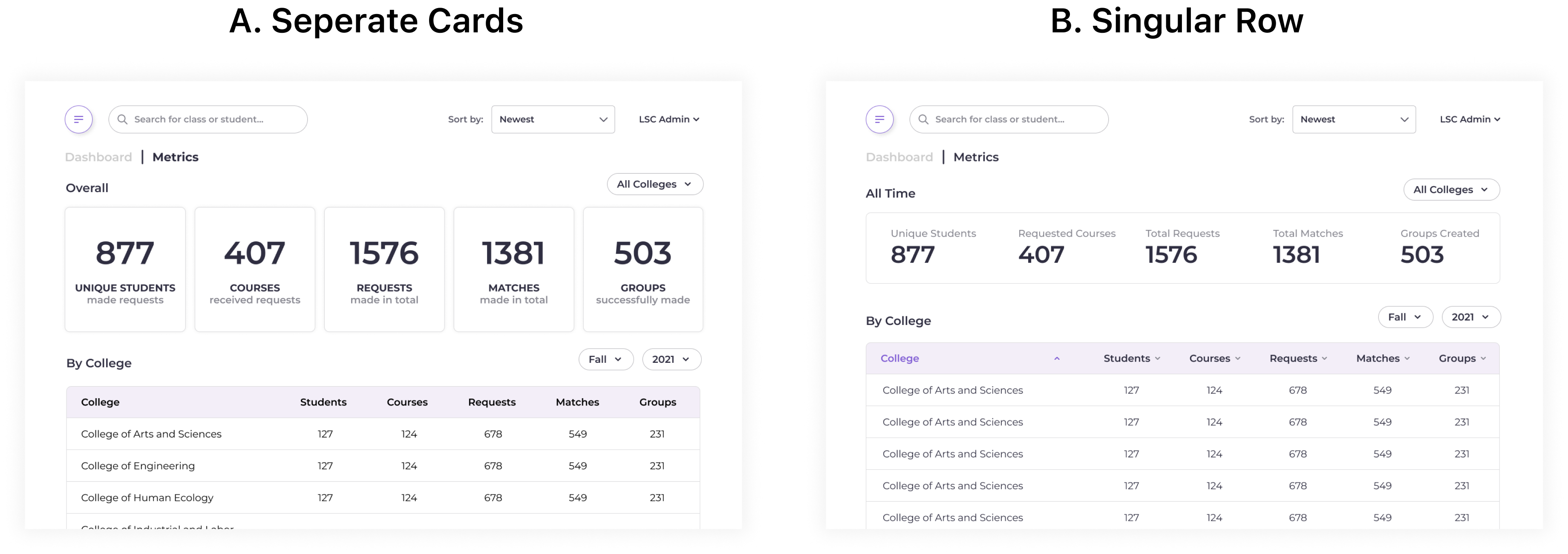
A. Seperate Cards ✅
Pros:
- Visual similarity to card style of dashboard
- More space for text = More descriptive data
Cons:
- Less clean
- More visually prominent

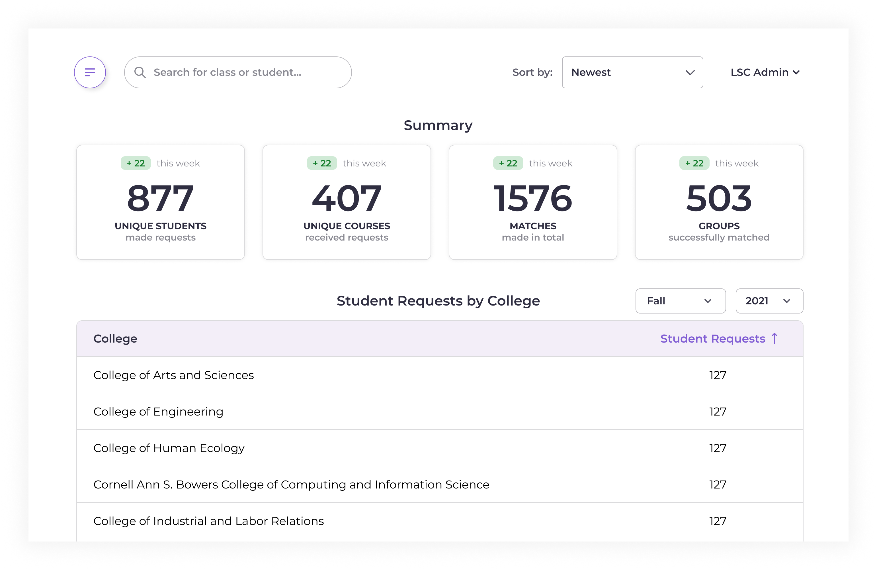
Final Screen
The metrics feature had final touches completed during high-fi iteration and was handed off for implementation by developers.
03 - User Research (Grouper)
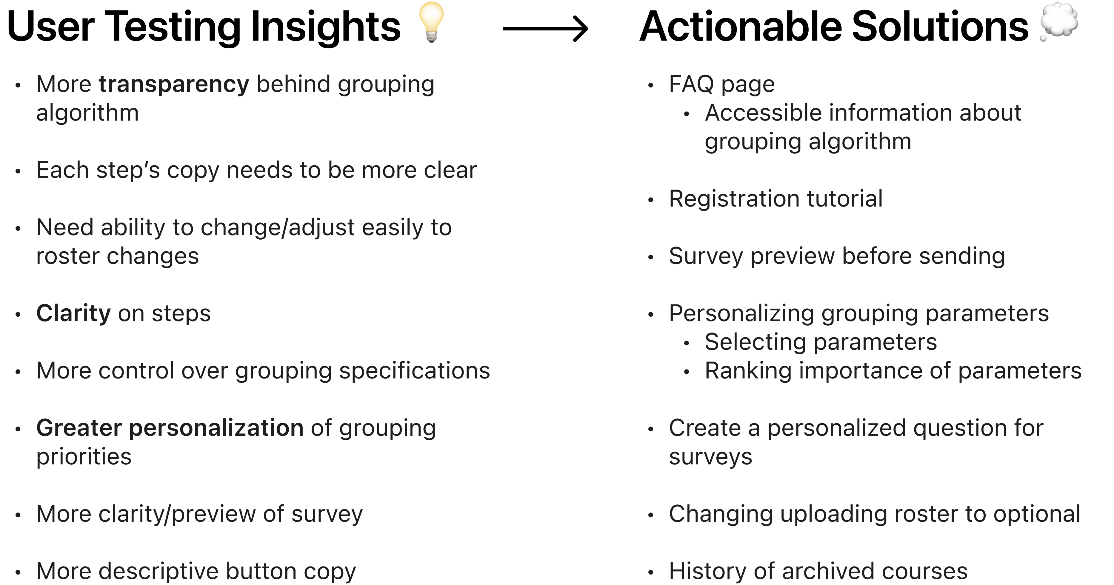
We conducted user testing with the V1 prototypes of Grouper and learned a lot...
MVP
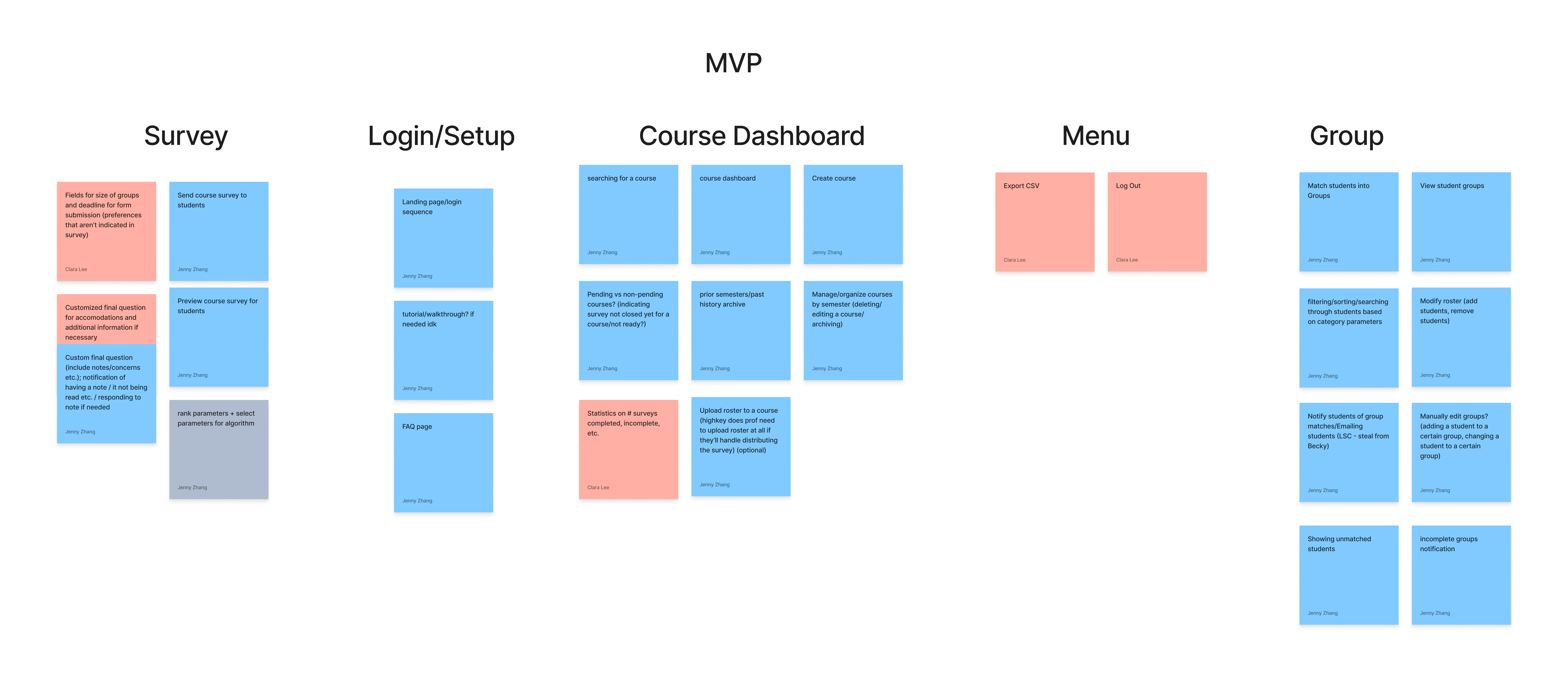
From these ideas, we coalesced all our thoughts into sticky notes and evaluated brainstormed features.
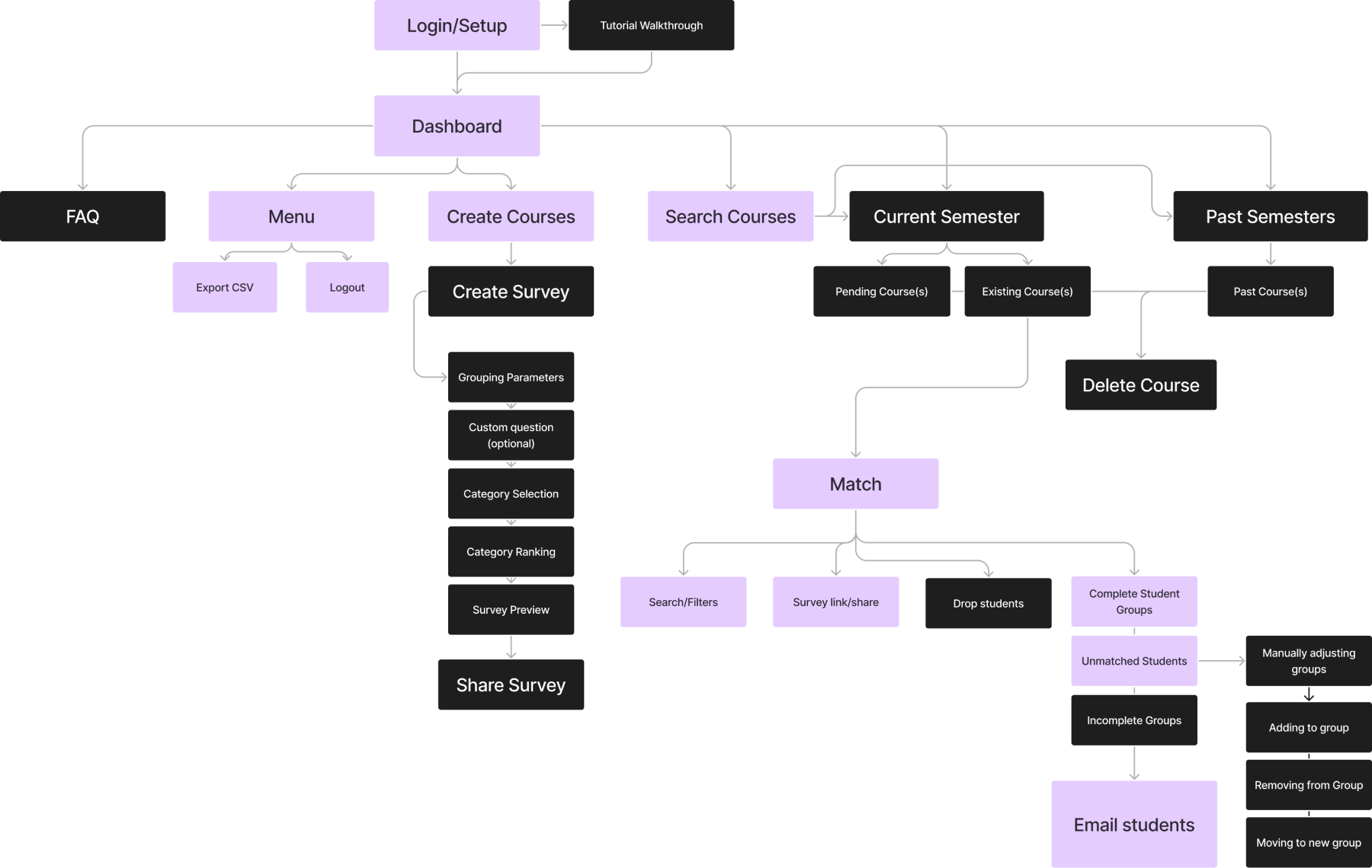
Information Hierarchy
04 - Course Archive (Grouper)
Overview
I focused on the Course Archive feature to help professors access previously added classes.
User Group 👤
Course Professors
User Needs 🗣
- View previous courses.
- Add previous courses into the current semester.
Viewing Archived Courses
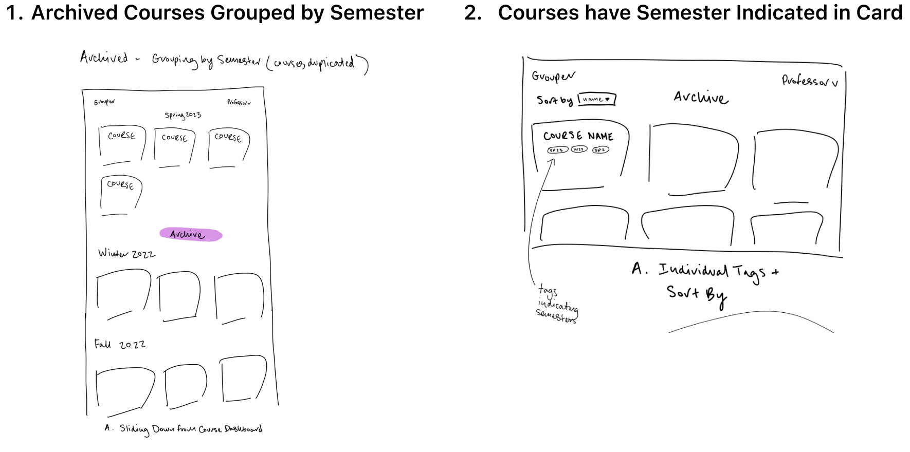
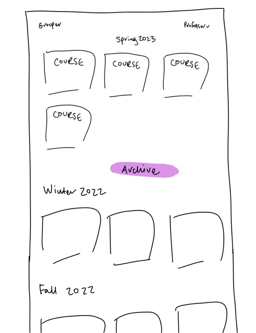
1. Archived Courses Grouped by Semester ✅
Pros:
- More organized
- Less daunting
Cons:
- More scrolling
Entry Point
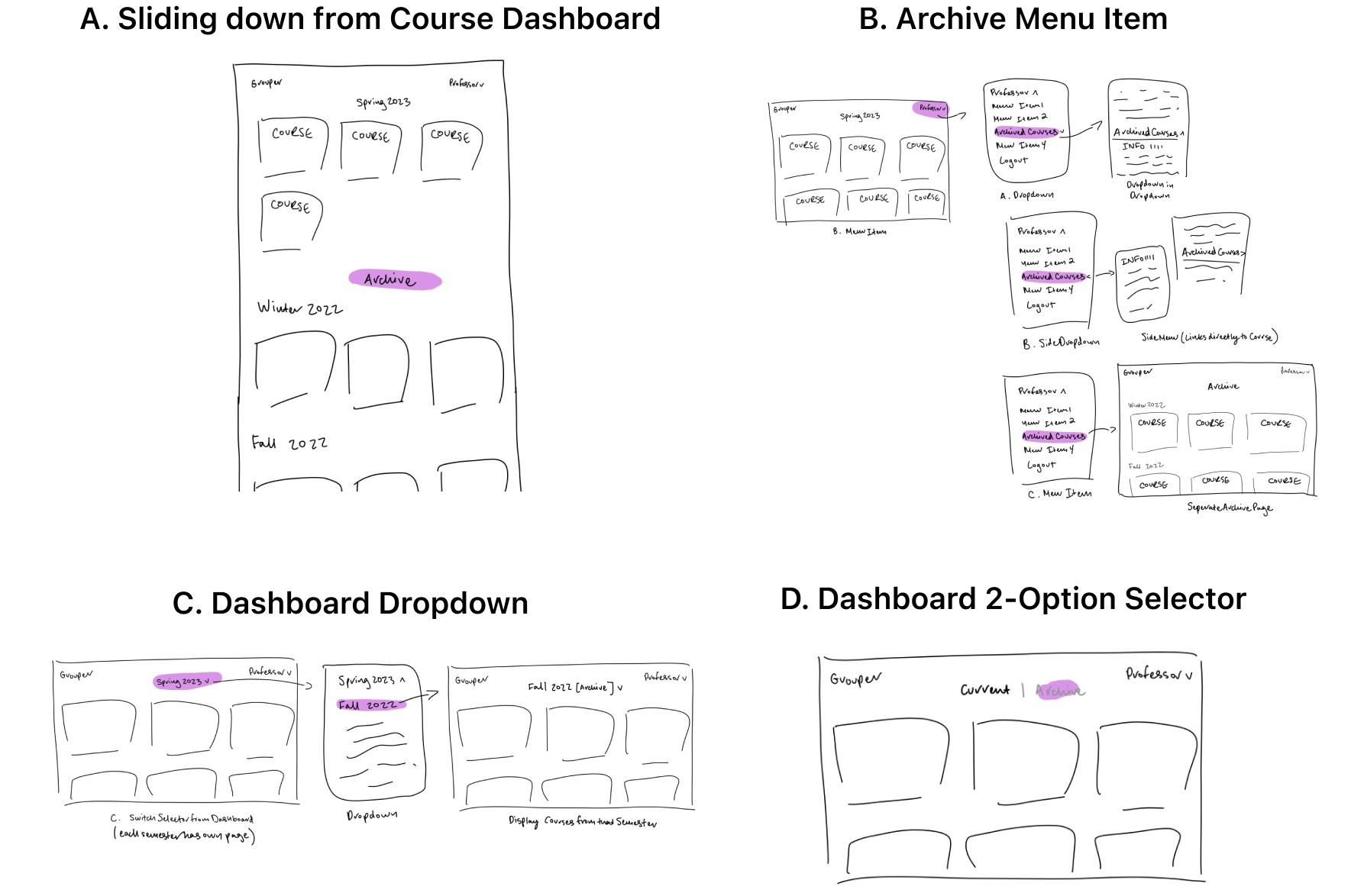
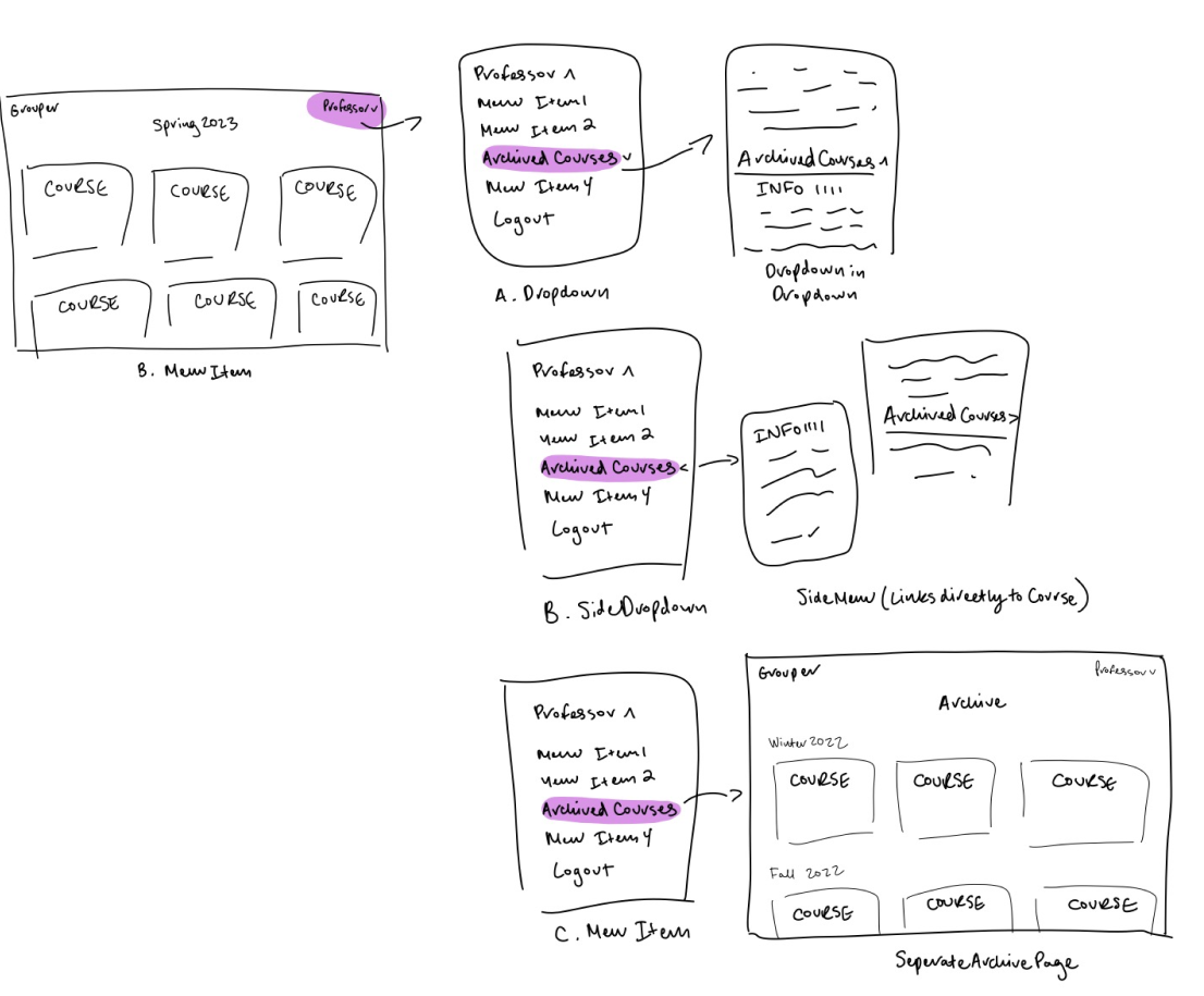
B. Archive Menu Item ✅
Archive in the menu is fitting due to similar features also being grouped as menu items (statistics, settings, etc.) without being too intrusive, as Archived Courses wouldn’t be viewed especially often.
Adding Course from Archive

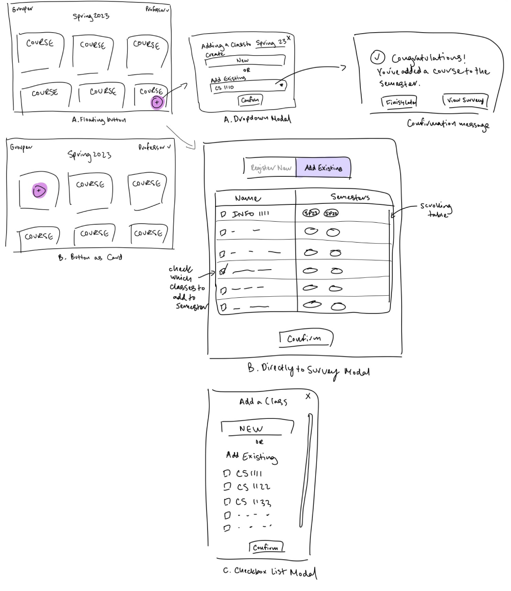
1. Same Add Button (New and Existing) ✅
Pros:
- Groups similar actions to be less confusing
- User wouldn’t differentiate between the two actions when looking for entry point
Cons:
- Copy between inside modal and different flows if existing in comparison to new need to be extremely clear
- More dense
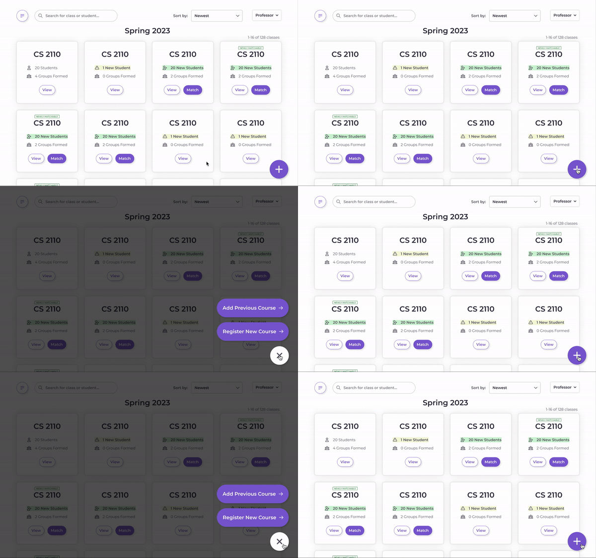
Prototype
06 - Takeaways
Learning to step in...
I came onto the team when the product had already been established, which forced me to gain familiarity with an entirely new product. Maybe my biggest takeaway was learning when to question previous designs and always be ready to do better to create the great final LSC that has already been implemented and entirely handed off to our stakeholders.
And learning to let go...
Especially given the super talented Zing team, we realized that we wanted to create a product that would truly be meaningful and have an impact in our community. After realizing that Grouper would unfortunately not meet those hopes, we decided to let the product go. As we talked with professors, we realized that grouping students, while annoying, was also a process they were willing and wanted to take an active part in, even though time-consuming. Given professor reluctance and the individuality of the way professors create groups depending on their classes, is this a problem space the product can truly be impactful with?